
The Core Problem: Why Traditional Homepages Kill Your B2B Website Conversion Rate
Your B2B homepage is a roadmap to indecision, and it’s costing you leads. Most homepages are crafted for navigation, filled with distractions, multiple CTAs, extensive menus, and generic messaging, that create friction instead of action. This design is the enemy of high conversion rates. By building sites for browsing, not decisive next steps, you inadvertently send prospects elsewhere.
Traditional homepages introduce friction, a well-documented web design issue that severely impacts user action and lead generation. Friction leads to confusion and hesitation, causing visitors to leave or delay engagement. The Nielsen Norman Group elaborates on this design friction concept and its impact on user decisions, emphasizing the need for websites to reduce cognitive load and simplify pathways to conversion.
The Three Killers of B2B Growth (And the Need for a Frictionless Website Experience)
B2B buyers are more distracted, more skeptical, and less patient than ever. When they land on your homepage, they’re not looking to “explore”, they want clarity, relevance, and proof. Unfortunately, most homepages do the opposite. They overwhelm, confuse, and scatter attention away from your core conversion path.
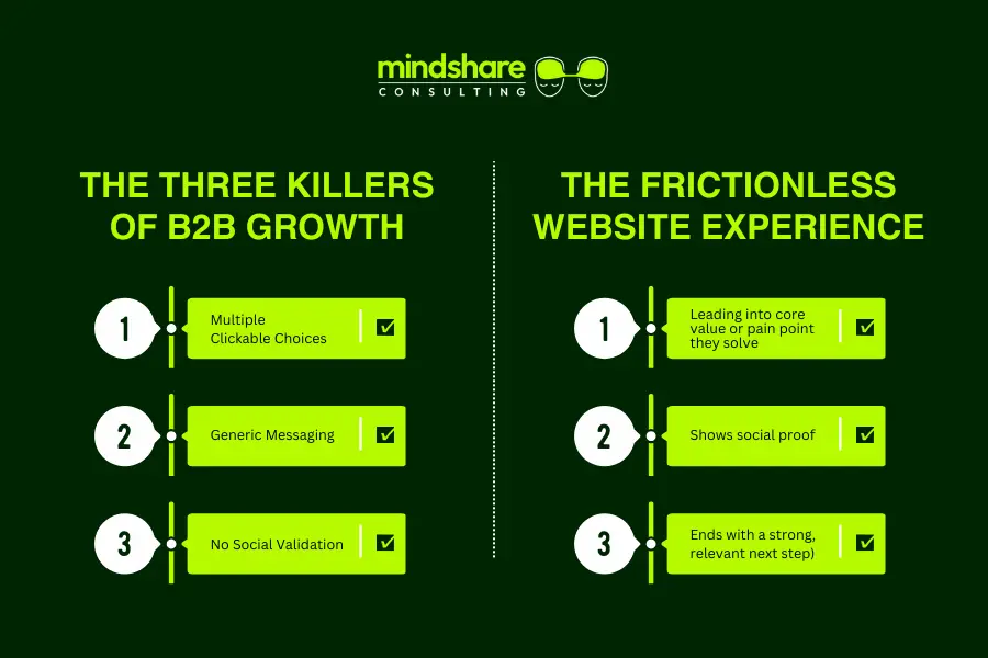
Here are the three silent killers holding back your growth:
The Choose Your Own Adventure Problem
Most homepages give visitors 15 to 30 different clickable choices. Product pages, blog links, case studies, navigation bars with five-layer dropdowns. Multiple CTAs above the fold.
This overload forces prospects to decide where to go instead of guiding them where they should go. When everything looks important, nothing is.
Result: High bounce rates, low conversions, and no clear revenue path.
Generic Messaging
Trying to appeal to everyone creates messaging that resonates with no one.
Homepage taglines often promise “quality solutions,” “innovative services,” or other vague claims that fail to reflect the buyer’s actual pain point. B2B prospects need precision, not platitudes.
Result: Prospects feel unseen, misunderstood, and unmotivated to continue.
Invisible Proof – No Social Validation, No Trust
Your visitors want to believe you, but they need evidence first.
When homepages hide or lightly scatter social proof like case studies, ROI outcomes, client logos, testimonials, win stories; trust friction spikes. And trust friction kills conversions.
B2B buyers will always default to vendors who show results, not just claim them.
Result: Lower authority, weaker credibility, slower pipeline movement.
The Antidote: A Frictionless Website Experience
A frictionless website experience replaces the scattered homepage with a singular, guided narrative. Instead of forcing visitors to choose their own path, you walk them through a story engineered for one outcome, a high-value action.
This experience:
- Opens with clear audience targeting
- Leads immediately into the core value or pain point you solve
- Shows social proof exactly where trust drops
- Removes competing distractions
- Ends with a strong, relevant next step (book a call, schedule a demo, request a strategy session)
The result is a controlled, high-intent conversion journey proven to generate dramatically higher leads, often 200 percent or more because the user’s attention no longer leaks in twenty directions.
This principle aligns with the broader trend in web design toward minimalist, goal-oriented approaches. For deep insights on this approach, check how professional content marketing can get you an edge over competitors.
The Psychology Behind Frictionless Conversions
Reducing friction taps into fundamental psychological principles influencing decision-making and commitment. Cognitive overload, the phenomenon where too much information causes confusion and inaction, is a critical barrier on traditional homepages. By simplifying choices and offering clear, consistent messaging, frictionless designs reduce anxiety and encourage immediate trust and engagement. This leads to improved emotional connections and a higher likelihood of action.
The Power of One-Page Website Conversion
Before transformation, the traditional homepage suffered these challenges:
- High bounce rates as visitors struggled to decide which path to take.
- Low time-on-page metrics, indicating disengagement.
- A poor Marketing Qualified Lead (MQL) conversion rate, hampering sales pipeline quality.
After switching to a singular, long-form sales page:
- Bounce rate dropped significantly as visitors were engaged longer.
- Time spent on the page increased, keeping prospects immersed.
- Most notably, the MQL rate surged by 270%, proving the efficacy of a focused funnel.
Structural Breakdown: The 7-Step High-Converting Landing Page Blueprint
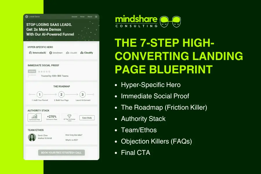
The new homepage as a landing page must include these core elements for maximal conversion:
- Hyper-Specific Hero: The hero section must articulate a clear pain point and the precise solution offered, tailored to the visitor’s context.
- Immediate Social Proof: Client logos, testimonials, and trust badges placed here build instant credibility.
- The Roadmap (Friction Killer): A simple 3-step process illustrated in a digestible format demystifies the service and reduces hesitation.
- Authority Stack: Show detailed proof points such as case studies, metrics, and awards to deepen trust.
- Team/Ethos: Humanize your company by introducing the experts behind the service, fostering connection.
- Objection Killers (FAQs): Preemptively address common concerns and questions to reduce friction.
- Final CTA: A single, compelling call to action that stands out and is impossible to miss.
For further guidance, visit Unbounce’s long-form landing page best practices
Crafting Persuasive Copy for Each Section
Each section requires carefully crafted copy utilizing persuasion techniques such as social proof, storytelling, and specificity. For example, the hero message should instantly resonate by naming the visitor’s pain, while the authority stack benefits from quantitative proof points. The FAQ section should be written to shield against doubts and objections, boosting confidence right before the CTA.
Implementing a B2B Lead Generation Strategy for MQL Quality
A high-performing B2B lead generation strategy prioritizes Marketing Qualified Lead (MQL) quality over raw volume. One of the most effective ways to achieve this is through a structured, one-page landing experience built around a sequential narrative. Instead of fragmenting attention across multiple pages, menus, and CTAs, a single, guided flow ensures every visitor progresses through the full value proposition before reaching the conversion point.
This narrative-driven approach acts as a natural filter. By the time a visitor clicks the primary CTA, they have already consumed your positioning, pain points, solution clarity, differentiation, and social proof. Research shows that leads who engage deeply with content before conversion are up to 3x more likely to enter a sales conversation and convert compared to form-fillers driven by surface-level offers.
From a sales perspective, this pre-qualification dramatically improves efficiency. Sales teams spend less time chasing low-intent leads and more time engaging prospects who already understand the value, pricing context, and expected outcomes. Organizations that align marketing and sales around qualified lead experiences report up to 36% higher close rates and shorter sales cycles.
Ultimately, a frictionless, one-page lead generation model doesn’t just increase conversions. It elevates lead quality, improves MQL-to-SQL handoff, and turns marketing into a predictable revenue engine rather than a volume-driven cost center.
Technical CRO for a Frictionless Website Experience
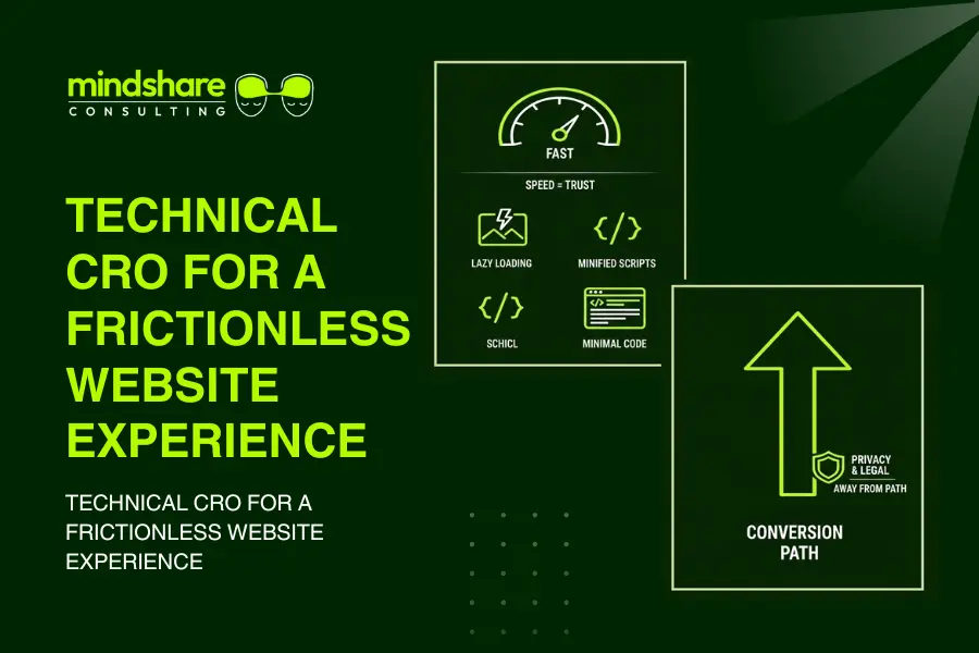
Speed equals trust. A slow website undercuts confidence and kills conversions. Employ technical optimizations such as lazy loading of images, minified scripts, and minimalistic code structures to deliver near-instant loading times despite the landing page’s length. Privacy policies and legal disclaimers should be placed away from the conversion path to protect flow without sacrificing compliance.
For analytics and conversion optimization methods, see Mindshare’s high converting website design guide
Mobile Optimization, Converting on Every Device
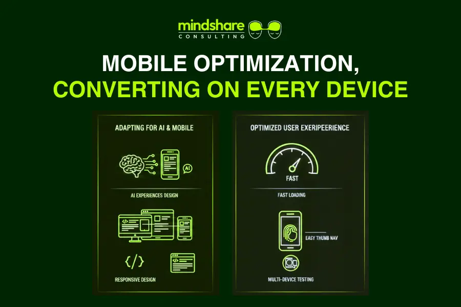
With over half of B2B traffic originating from mobile devices and now going directly in the AI experiences/chat, ensuring the frictionless landing page optimized for AI, performs flawlessly on all screen sizes is crucial. Responsive design elements, fast loading on mobile networks, and easy thumb navigation are essential. Testing on multiple devices guarantees a consistent, high-quality user experience that does not lose conversions due to technical hiccups.
Transform Your Homepage into a Lead Generation Website
The 270% conversion secret boils down to eliminating indecision and friction. Traditional homepages are obsolete for B2B lead generation. Embrace a singular, powerful, high-converting funnel instead. This is how future-ready companies own their conversion rates and fuel scalable growth.
Final CTA:
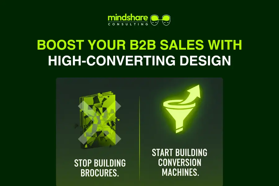
Stop building brochures. Start building conversion machines. Let Mindshare Consulting help design your high-converting landing page and dramatically increase your B2B website conversion rate: Schedule a call now